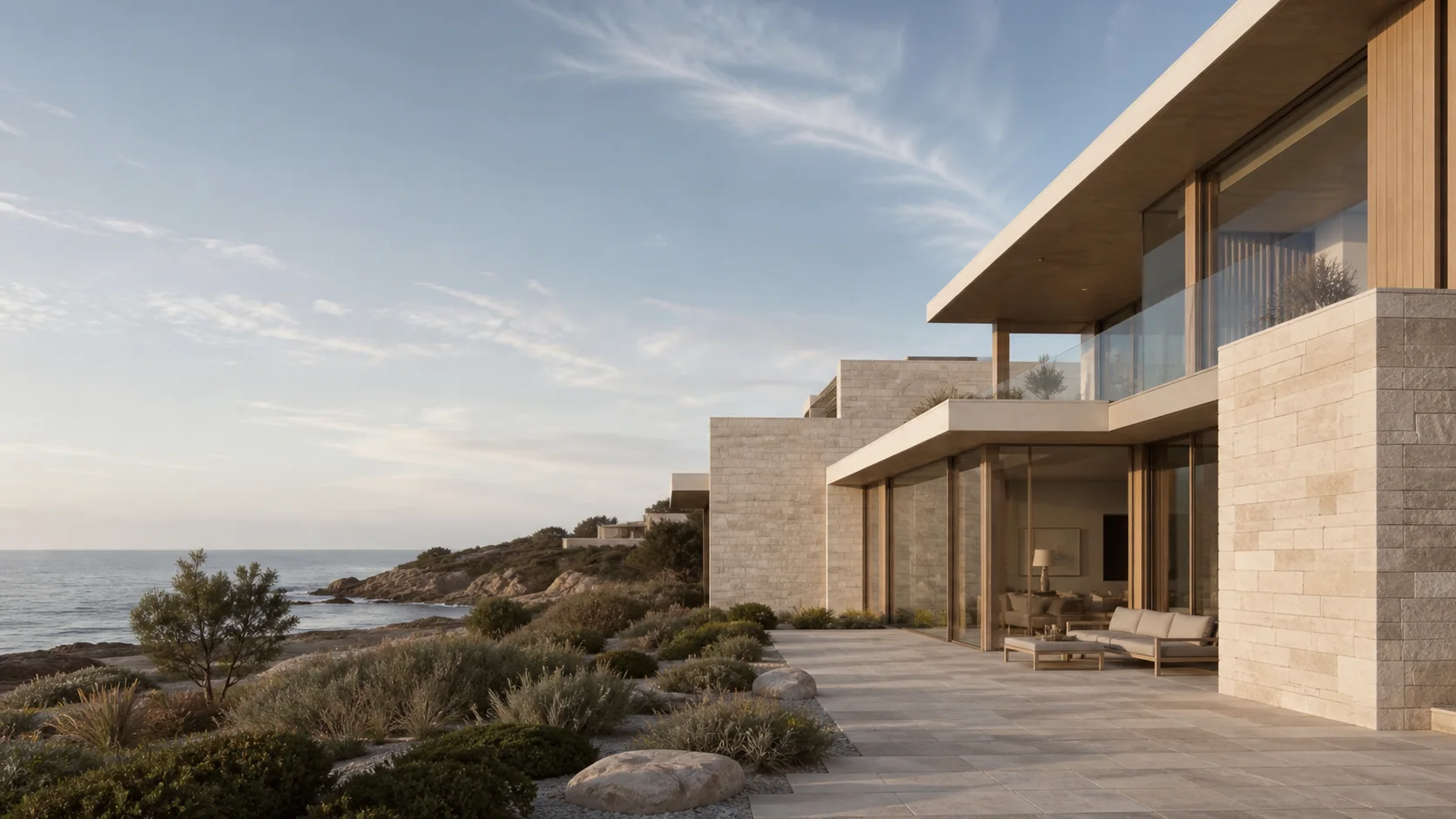
Life, composed
at the waterline.
A limited collection of fictional coastal residences shaped around light, material, and the horizon.
Create the emotional pacing of a luxury editorial while keeping availability and viewing actions easy to find.
Use restrained copy, generous image scale, and progressive property detail rather than a crowded listing grid.
Something you can click, not a screenshot.
It shows how a page can take someone from a first look to getting in touch. Nothing here is wired to real customer data, a real booking system, or a real payment.
The same idea, rebuilt for the smaller screen.
The phone version is laid out again from scratch. It is not the desktop page shrunk down until it fits.
Anything that moves is kept light, so the page stays quick to use on an older phone.
If a visitor has asked their device to limit animation, the movement stops and everything is still reachable.
Buttons are big enough to hit with a thumb, and nothing important is hidden until you hover.
Use the idea as a starting point—not a template.
Your site would get its own pages, its own look, and a scope agreed with you.